Design Harness
My setup for AI design work. It has one process, a critic that only ever sees screenshots, and my taste written down where every session reads it first.
My setup for AI design work. It has one process, a critic that only ever sees screenshots, and my taste written down where every session reads it first.
publish_to: []
The most useful part of my AI design setup is a critic that only ever sees screenshots. It gets no code, no reasoning and no earlier critiques. Shown the first round of this site’s home page, it called it a “hero-plus-card template”. At rest, before any photo appears, it read as “a page whose hero image failed to load”.

Round one, 5/10. The place photos sat behind the life grid, with a card floating over them.
Every design session with an AI falls back on the same defaults: the full-width hero photo, the grid of identical cards, the soft glow, the little label above every heading. That look now reads as “an AI made this”, and round one fell straight into it. I’d set up two design skills before this and ended up switching both off. So I rebuilt the setup around a brief to myself: fewer skills and less sprawl, with better scaffolding, and a loop that sharpens my own design sense as it goes, not just the output.
There’s one process now, adapted from Anshu Chimala’s How to turn your AI into a world-class designer with the planning step from Anthropic’s frontend-design skill. It explores wide before it narrows, plans exact colors and type before writing any code, and checks the plan against what a generic prompt would have produced. Every session first reads a note of my design taste, built from my own reactions, and a design file for the project with its exact colors, fonts and spacing. One line in that note is about this site: every page should be its own world, “almost like a video game with different race courses … rainbow road vs. the beach … but the gameplay is the same”.
The critic is a separate agent. It names a real designer as the bar (Craig Mod in one round, Nicholas Felton’s annual reports in the next), lists the gaps in order, marks down the usual machine tells, and scores out of ten. The rule for when to stop (a 9, or three rounds) lives with the builder, so the critic can’t grade its way to finishing. A first-round 9 with nothing to compare it against isn’t trusted.
By round three the photo had moved under the grid, and nothing covered it.
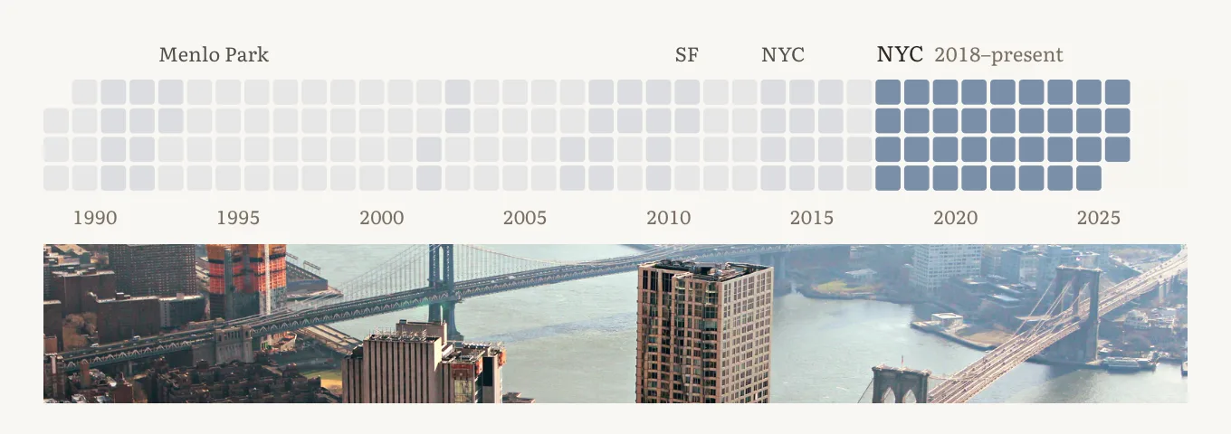
Round three, 6/10. The critic’s next ask was a grid that reads before you touch it, with every place named.
The score never got past six, and on craft the critic was usually right. Where it went wrong was taste. It was built around restraint, and so was the brand reviewer working beside it. When I asked for more wow, the two of them cut every bold idea: one round started from about 110 ideas and shipped an italic note, a yellow underline and one photo. My verdict was “a little weak… so little fun, color or WOW”. But I hadn’t said what wow meant, and the next round missed the other way, with hover effects that were “loud and not creative; I’d rather subtle and very creative.” I asked for wow for three rounds before I could say what it was. Intensity and invention are separate dials. The critic now watches motion frame by frame instead of judging stills, and its restraint counts as advice, not a veto.
The critic is useful because it can’t see why I made a choice, only what’s on the screen. Every visitor is in the same position.